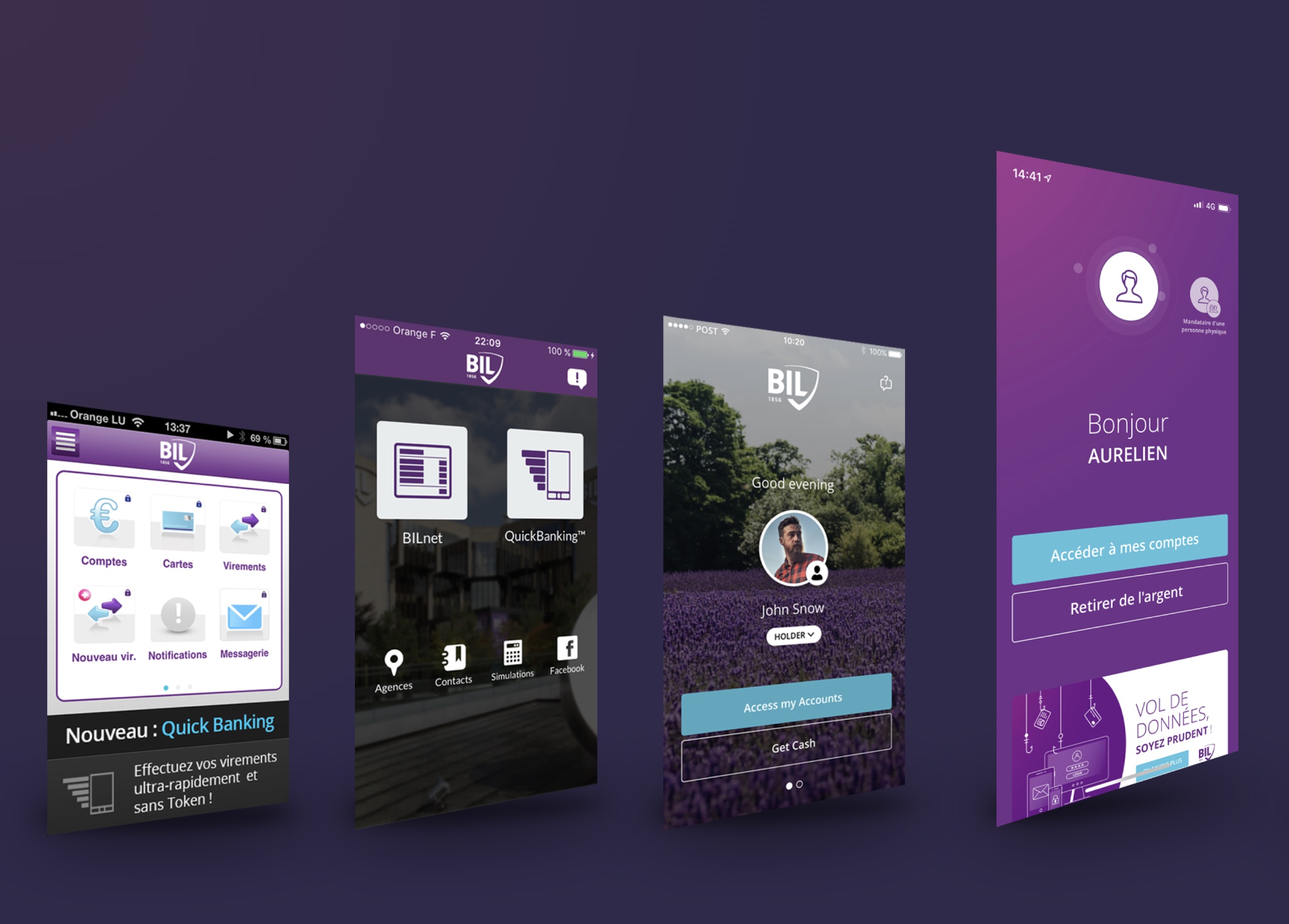
What happens when a bank focuses on the user experience?
Have you ever felt like pulling the plug on your PC or throwing out your smartphone when you’re trying to use a company’s app? Maybe there were multiple error messages, you couldn’t find the feature you were looking for or you had to jump through a million hoops to pay a measly €20 – the bad experiences are endless. What if UX (user experience) could make all that a thing of the past? Here’s everything you need to know.
How can a bank stand out from the competition? In an era of increasingly uniform products and services, the client’s everyday experience can make all the difference. And, in this regard, banks are well aware that it’s up to them to adapt to their clients’ needs, not the other way around. Their efforts to do just that rely on a growing discipline called UX (user experience). UX is about much more than just digital interfaces. myLIFE has interviewed BIL’s subject-matter experts to help you understand the steps the bank is taking to improve your experience of interacting with BIL.
What is UX?
As the name suggests, UX involves focusing on the user’s overall experience of interacting with a system or service offered by a brand. For Nathalie Knops, Head of Business Transformation at BIL, “UX is a new way of approaching our clients’ needs and understanding how they interact with the bank during branch visits, when they log into their online banking area, when they call their banker or when they simply withdraw money at an ATM.”
The emotional aspect of the experience means that we have to look at client interactions from a human perspective rather than a technical viewpoint alone.
How can this experience be improved? Multiple factors are likely to affect the quality of the user experience. As such, UX relies on objective datapoints such as usability (how easy something is to use) as well as the emotional impact on the user. Aurélien Mellé, UX Design Team Leader at BIL, stresses that “these two aspects of the user experience are essential and inextricably linked. Both must be taken into account for a good UX. The emotional aspect means that we have to look at user interactions from a human perspective rather than a technical viewpoint alone”. In other words, the interaction shouldn’t just be an effective way to complete a task. It should also be a pleasant – or at least not unpleasant – experience for the user.
How does it work?
“Considering the emotional aspect of the client experience fundamentally changes how we work because the company can no longer develop solutions in isolation; instead, it must put the user and their context at the heart of every stage in the process,” says Nathalie Knops.
Let’s take a banking app as an example. Ideally, it should be simple, comprehensive, accessible and pleasant to use. But how can it be all of these things at once? If compromises must be made, which aspect should take precedence? The answer is simple: the user is always right, so choices must be made based on what matters to them. As such, users play a role in each major stage in the UX process, namely:
- Identifying users’ key needs and setting objectives for the banking app on this basis
- Identifying the app features that should be developed based on these key needs
- Identifying, for each feature, the ideal pathway for the user to take the desired action
- Setting out all pathways within a clear and intuitive system to allow users to easily jump from one feature to the next
- Working on the visual rendering to make the app attractive and pleasant to use
As these stages show, focusing on UX profoundly affects the bank’s operations. It also means caring about the experience of members of staff, since clients’ experiences are shaped by their interactions with the bank’s various digital and physical services. As UX is a global approach, it must be implemented with the support of the entire team.
The more effective and pleasant your user experience with a bank, the happier you will be with your choice of bank and the more likely you will be to tell others about it.

What advantages are there?
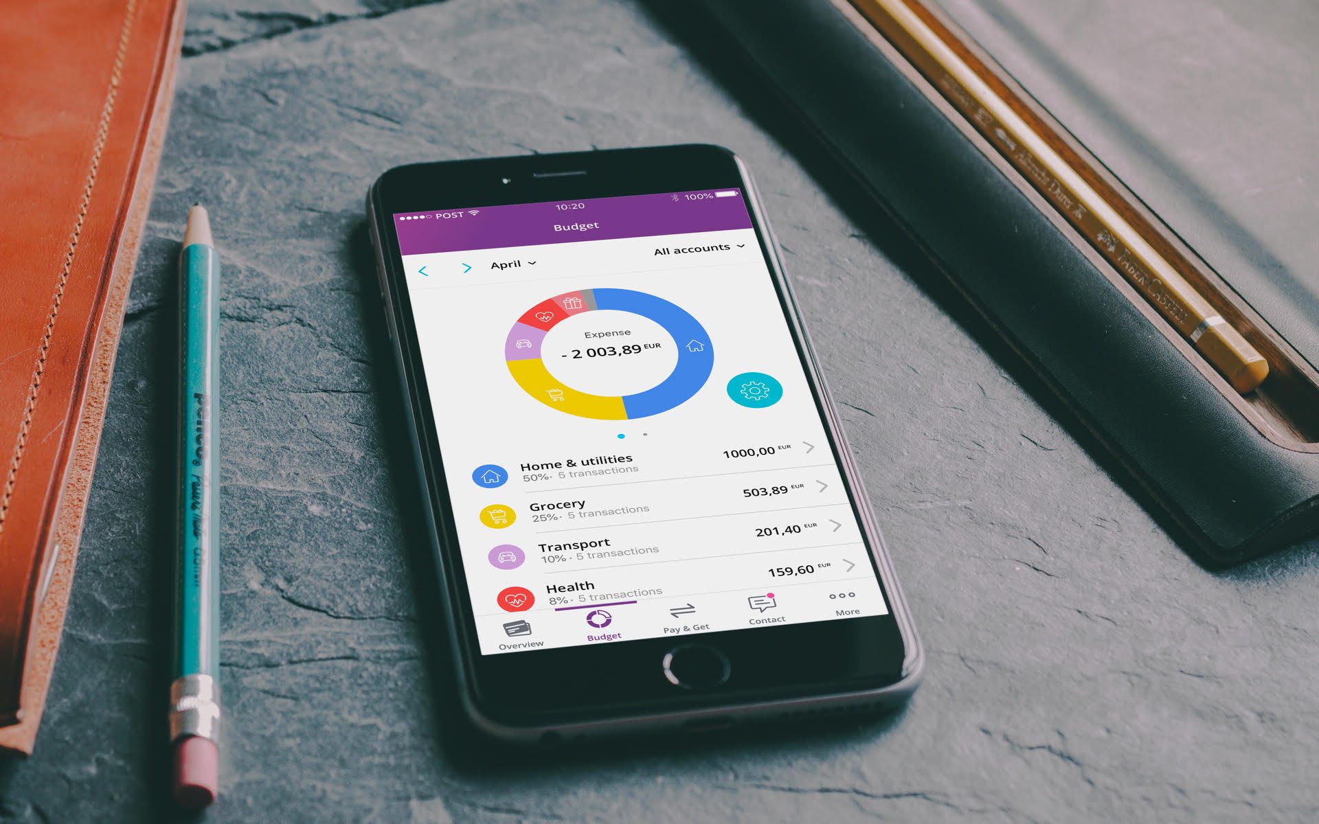
Aurélien Mellé summarises the main advantage as follows: “The more effective and pleasant your user experience with a bank, the happier you will be with your choice of bank and the more likely you will be to tell others about it.” On the subject of the budgeting app developed with the support of his teams, he adds: “We worked together to think through the various client pathways, produced prototypes and even organised a co-design session with bank employees. Then we put our findings to client focus groups. As a result, the solution was adopted quickly and without any setbacks. That meant we could pour our energy into other types of interaction between the bank and its clients.”
From this perspective, US is a win-win approach to the bank-client relationship. Offering a good UX allows the bank to stand out from the competition and to:
- Decrease the likelihood that a client will stop using a service or type of interaction with the bank
- Increase the speed and rate of adoption (i.e. see a growing number of people make full use of the service or type of interaction)
- Boost loyalty among clients who are satisfied with their experience with the bank
- Turn clients into genuine ambassadors for the bank among their peers
Nathalie Knops stresses that UX offers yet more major advantages for the bank: increased process efficiency and enhanced project quality. “By including the client perspective from the start of the process, the bank devises solutions that are far more targeted to meeting real expectations. This helps us to allocate human and financial resources to projects more effectively,” she concludes.
In summary, the big brands have long asserted that the client is their top priority. We can congratulate ourselves that some have used UX to actually listen to what clients have to say – and are making great progress as a result!


 Mortgage
 Personal loan
 Savings